An Interview With John Bergin, ‘Mr. Robot’ Soundtrack Packaging Designer (Photos)
Order The ‘Mr. Robot’ Soundtrack CDs Here: [Vol. 1][Vol. 2]
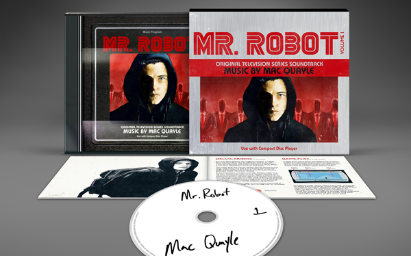
Mac Quayle’s score for the Peabody Award-winning Mr. Robot television series on USA Network is now available as a two-volume collectible CD set! Listen to the series score in uncompressed audio, thoughtfully packaged in a jewel case within an O-card slipcase, complete with an eight-page booklet.
In collaboration with series creator Sam Esmail, the CD packaging was designed by Lakeshore Art Director John Bergin. Extensive liner notes were provided by Sam Esmail and composer Mac Quayle. Read our interview with John Bergin (below), who gives us an inside look at the creation of the CD and vinyl soundtrack collectibles!
USA Network’s hit television series MR. ROBOT returns with Season 2 on July 13. Stream all episodes of Mr. Robot Season 1 on Amazon Prime here or rent it on iTunes here.
Tell us about the packaging design. You’ve put together a CD that looks like packaging for an old video game from the 1980s! Was the retro look something you settled on from the very beginning?
The package was developed with close involvement from Mr. Robot’s creator, Sam Esmail and Composer, Mac Quayle. The first thing Sam said was “Let’s make the CD really special. Something fans will want to own.” The second thing he said was “What if it looked like an old video game?”
We discussed a few other concepts, but we kept coming back to the idea of making the packaging look like a 1980s video game. In the show, fsociety is head-quartered inside an arcade and Mac’s music makes heavy use of amazing analog keyboard sounds, so the concept is a great fit.
There’s something familiar about the CD case…
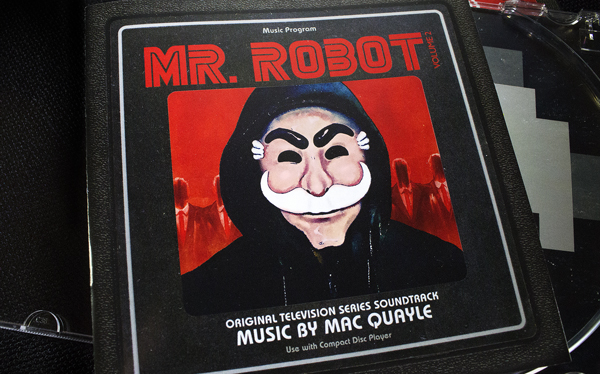
The jewel case is designed to look like a game cartridge on the top, sides, and back — complete with peeling labels and that textured black plastic everything was made of in the ’80s. The slipcase is like the box the game is shipped in.
Did you and Sam research games from the 1980s?
Research? We both grew up playing these games! But, yeah, we spent some time looking through old gaming boxes and manuals. It was quite a time-travel experience. Things that characterized game packaging from that time period were lurid hand-painted covers, faux-metal boxes, horribly designed instruction manuals, and a limited set of fonts like Bauhaus and Gill Sans (there weren’t a lot font choices back then!).
Aside from the look of the packaging, you also treated the first season of Mr. Robot like it was a video game.
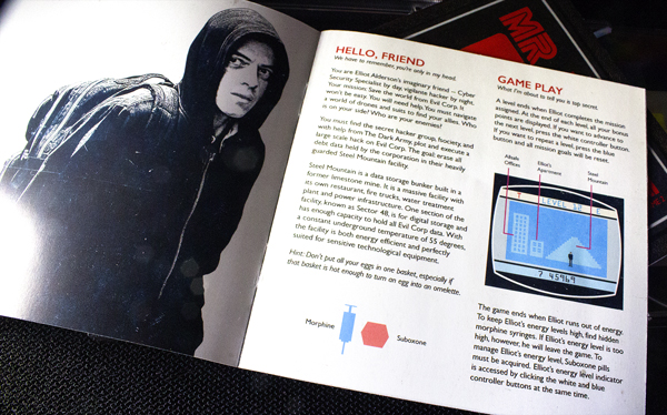
Sam and I reinterpreted important story points and brought them into the world of a 1980s video game. For example, in Season 1, Elliot frees Fernando Vera from jail. We asked ourselves “What would that look like as a 1980s video game? What would the gameplay be like? What sort of challenges would a player confront?” It would probably be a side-scroller with 8-bit characters jumping and running through a police station.
We wrote scenarios for ten different game levels with Elliot as the main character and I created maps and scenes for each level. For example, Level 1 is called “Socialize.” Challenges the player is confronted with in this level are things like “Talk to people!” “Give someone a hug!” Level 2 is called “Morphine,” Level 7 is “Steel Mountain.” Fans of the show will know which important story moments those titles come from.
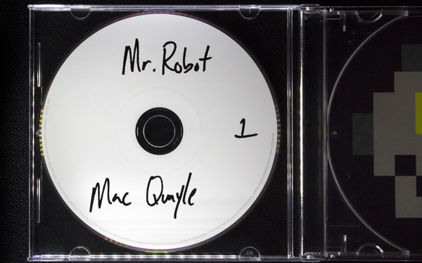
You have hand-written labels on the CDs, just like what Elliot does in the show with his archive of compact discs.
That’s Sam’s handwriting, by the way!
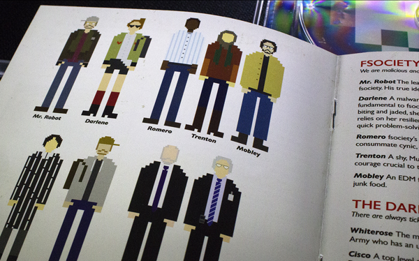
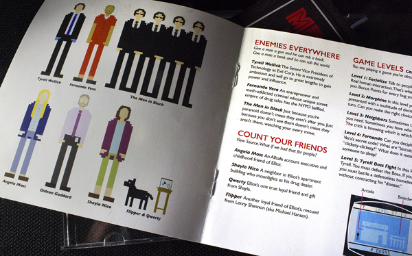
The booklet has all the characters from the show made into 8-bit characters. Tell us about those. How did you come up with the design for each one?
When you design an 8-bit character, you are limited to basic shapes and colors. It’s a testament to the brilliance of Mr. Robot’s production and costume designers that their characters can be made recognizable with just a few shapes or colors.
A testament, too, to the great writing. Each character has such a distinctive story arc. Sam titled his liner notes “Find a moment and understand it.” That’s what designing an 8-bit character is like; finding single moments and props or costuming that capture the essence of a character. Any fan of the show knows exactly who I am referring to when I say “Blue Latex Gloves” or “Quilt Art.”
The 8-bit characters are created by my daughter, Emma. She has a really great instinct for doing what I’ve just described; recognizing the essence of a character and showing it with just a few gestures. The characters are about two inches tall in the booklets, but they are so full of personality.
Do you have a favorite 8-bit character?
Qwerty is great. He’s just three cubes, but he’s so perfectly a Beta fish. I would love to play a side-scroller adventure as Qwerty.
Did you make the Mr. Robot artwork by hand?
Parts of it, yeah. Some of the illustrations. Most of it is digital, though. To mimic the limitations and imperfections of old design, I programmed my digital tools to be limited and error-prone. It’s subtle, but if you look closely at the booklets, for example, you’ll see the line-spacing and kerning of the text isn’t always perfect and some letters have been smudged or scratched off.
Were you inspired to do that by looking at the old manuals and boxes you mentioned?
Yes. In my memory, I recalled a lot of the graphic design of the ’80s as being vibrant and full of life. However, when Sam and I were looking through old gaming manuals, my first reaction was, “Oh My God. This stuff is terrible.”
“Terrible” in the sense that the limitations of the time are so obvious. Typesetting machines were imperfect, layouts were glued together by hand and shot on film. 1980s designs weren’t nearly as vibrant or slick in real life as they were in my memory (maybe that’s a lesson about nostalgia). I wasn’t disappointed about that, though. I loved it for being uniquely… wrong. If that makes sense? I tried to mimic that “wrongness” because it fit Mac’s music really well. I mean, there are parts of his score where things sound like they are breaking or falling apart. It’s a real talent to be able to make and capture that kind of chaos when so many of our creative tools these days are designed to be perfect.
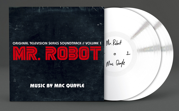
Lakeshore Records is releasing the Mr. Robot Vinyl Edition in partnership with Invada Records. And, you also designed the vinyl! What was the design plan for that?
I’ve designed the vinyl to be a companion to the CD. The vinyl packaging also looks like it came from the ’80s — again with aging and imperfections. The idea is that both the CD and vinyl look like things you might find inside the Mr. Robot store from the show: a store full of used gear and games. The back cover of the LP jacket for Volume 1 even has a Mr. Robot price tag. “Service With A Smile!”
Thanks, John, for taking the time to talk about your work on the Mr. Robot soundtrack!


